If you’re a nonprofit, chances are that your website is one of the central hubs where you promote your work and encourage visitors to donate to your organization. And if this is the case, making sure your website is in tip-top shape is essential to getting the most value out of this area of your online presence. Here are 10 tips for improving your nonprofit website to get site visitors to engage, interact, and follow through on action points when visiting your website.
1) Visitor Analysis: Create Personas to Define Your Ideal Visitor
When evaluating the effectiveness of your website, it’s important to initially perform an analysis of who your ideal audience is and how they’ll approach your website. Creating personas of your ideal audience can be very valuable in determining what your ideal user is looking for so you can make sure that content is readily available on your website.
Try this simple exercise to evaluate this aspect of your site: Put yourself in the shoes of a typical site visitor and look at your website. What is your eye drawn to first? What would you want to know about if you were a first time visitor? How accessible is that information currently? Is it easy to make a donation? Sometimes spending so much time on our own site can make it difficult to spot problem areas, so get another set of eyes if necessary, or, better yet, survey your current audience to get their opinion on what can be improved or modified, or what they’d like to see.
2) Usability: Create Clear Navigation, Forms, and Processes
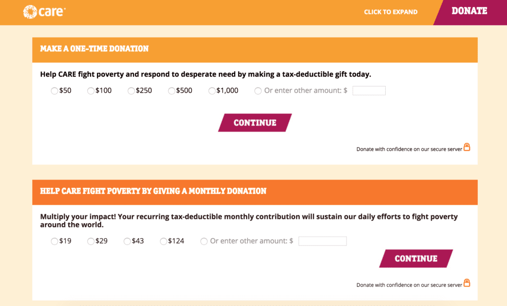
The fewer steps it takes a user to fill out a form on your site, the better. Especially if people are donating through your website, you want to make the form as easy as possible to fill out. This means leaving out extraneous information and only including the things you’ll actually use for processing the payment. Many nonprofits may see this as a great area to ask a few survey questions or ask users to subscribe to their newsletter – our advice would be to keep it simple and free of distractions, and create sign-ups or surveys on other areas of your site.
Having clear navigation and processes is also essential to keeping users on your site and helping them find what they’re looking for. Keep drop-down menus three levels deep max so that users don’t have to click through a ton of pages to get to what they’re looking for. People naturally drop off the deeper they have to go into the site to find information (and they may even never end up finding it). This means that it’s important to have one-click options for sending visitors directly to what they’re looking for.

Tip: Check out the visitor behavior option in Google Analytics to see how visitors are flowing through your site. Where is the largest drop-off percentage? What percentage of people are bouncing on the home page? How many pages are people clicking through before leaving the site? How many times do visitors return to your site before taking action? All of these factors can be great indicators for areas that can be improved or re-evaluated.
3) Visual Storytelling: Utilize Images and Video to Engage Your Audience
Telling your story through images and video is invaluable, especially for first-time visitors who want to quickly learn about your organization without having to read through a lot of content. That’s not to say that content isn’t as equally important—it’s great to have both aspects to appeal to a wider audience and readership, but the following 2015 video stats from Social Media Today are pretty compelling:
- 52% of content marketing professionals worldwide name video as the type of content with the best ROI
- 93% of marketers use video for online marketing, sales, or communication
- B2B and B2C marketers worldwide name video as a top 3 most effective social media marketing tactic
- 74% of all internet traffic in 2017 will be video
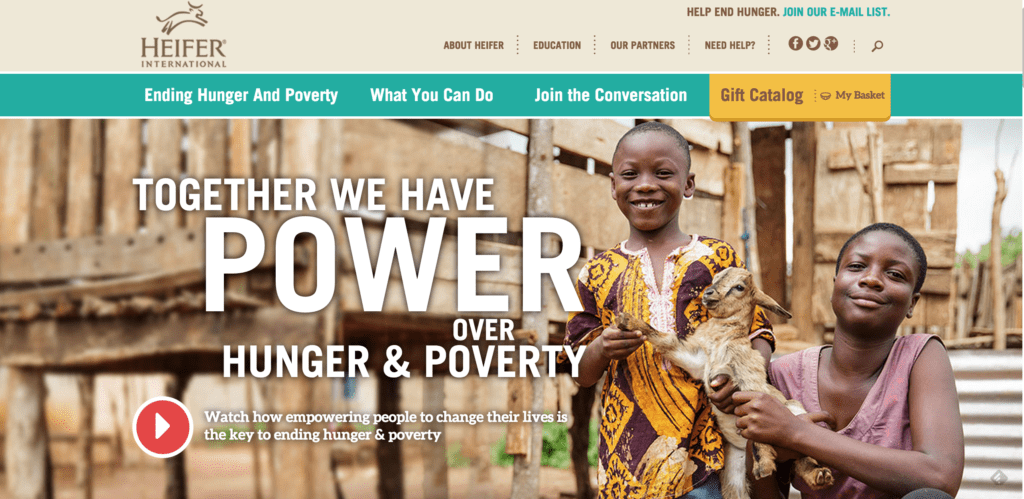

https://www.eyeamorg.com/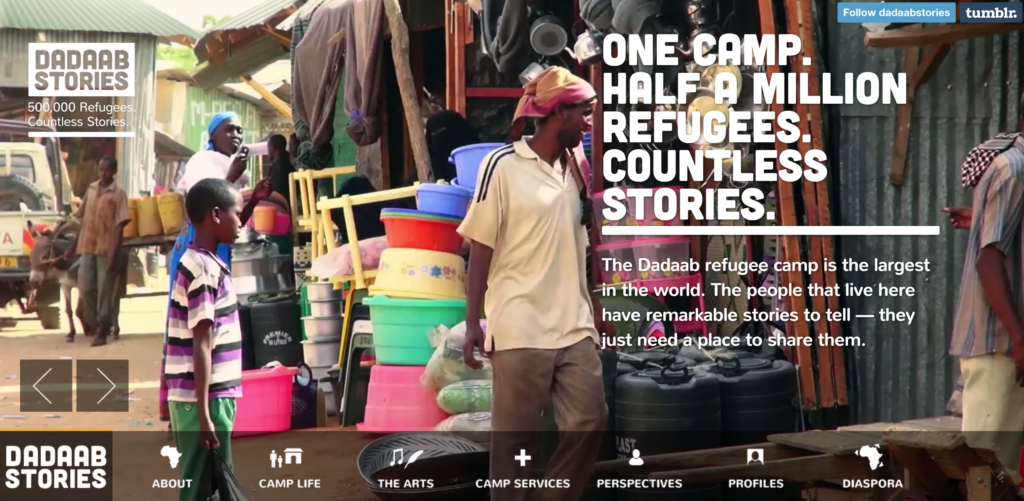 https://www.dadaabstories.org/
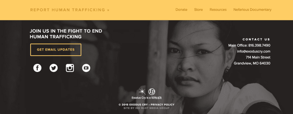
4) Email Sign-Up: Stay in Touch with Your Audience
Include options for site visitors to sign up for your newsletter so that you can easily send them updates and news. Typically, most sites will have a quick sign-up form in the sidebar or footer of the site specifically for this purpose.

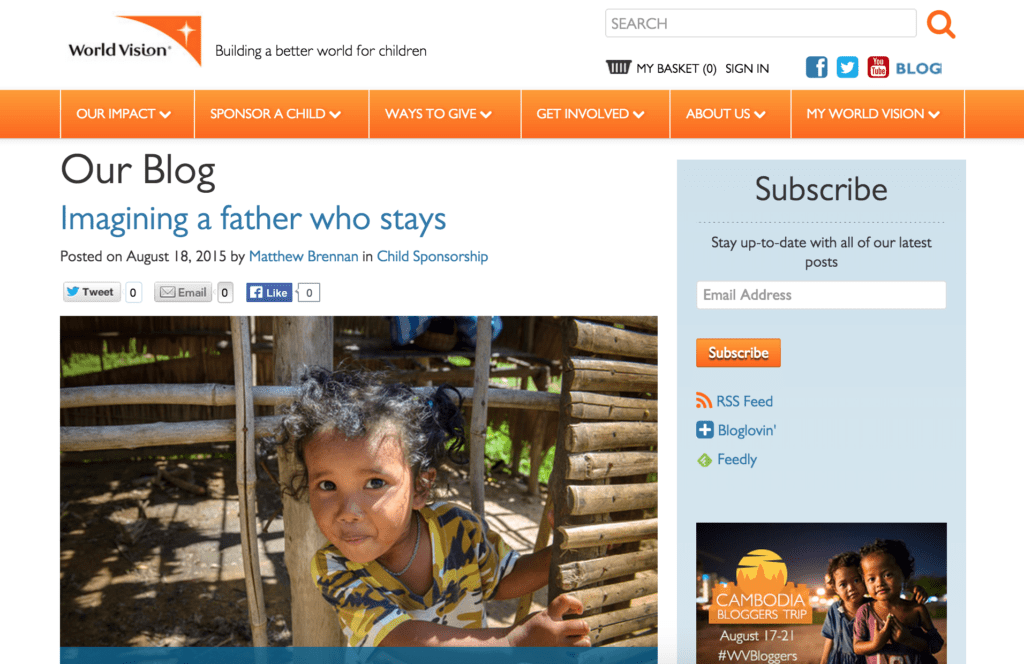
5) Create a Blog: Draw Site Visitors in with Valuable Content
Having a blog is essential for any nonprofit, and serves as a great place to do the following:
- Inform your audience about successful projects and/or trips
- Promote upcoming fundraisers and events
- Profile individuals working within your organization
- Provide commentary on current events in the area(s) where your nonprofit operates
- Share your expertise in your area of work
- Build trust and increase conversions (by providing updates from the faces behind the organization)
6) Incorporate Social Feeds: Encourage Sharing and Interaction
Your website is a great place to promote your social media accounts or create interest for new followers. Include social links so that site visitors can easily link back to your accounts. Use your website to promote contests, and include social feeds for Twitter, Instagram, and/or Facebook to give visitors a sneak-peek into what you’re posting. Social media is great for reaching and engaging with a younger audience, recruiting volunteers, and providing general updates for donors and supporters.
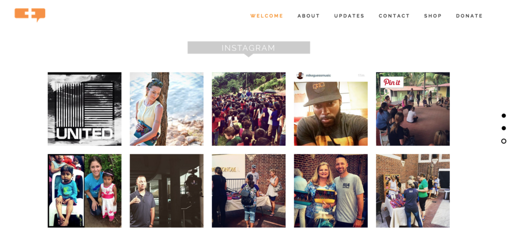
https://www.ru4children.org/#get-involved
7) Calls to Action: Make Them Clear and Straightforward
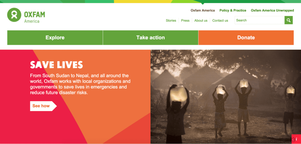
When a user first hits your site, what do you want them to do? Nonprofit sites typically have a call to action—for example: “help now,” “volunteer today,” or “donate” that presses users to take immediate action. The clearer and more straightforward these calls to action are, the better. Make sure your donate button or tab is easy to distinguish (most of the time this is in the header or main menu). Also, make sure your menu tabs are titled appropriately so that site visitors know exactly where to go if they want to volunteer their time or donate to your organization. Again, streamlining this process will result in less risk of visitors leaving the site because they can’t find these items. Consider multiple ways of getting users to the pages you want them to ultimately reach. For example, including a donate link at the bottom of each page/project/blog post will create multiple paths that lead to the same action page.
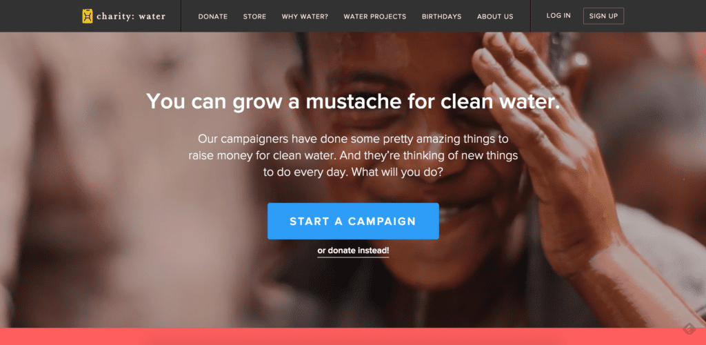
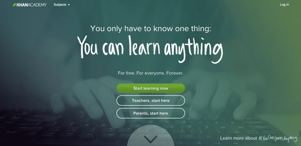
8) Share Results: Concrete Examples of past Successes Build Trust
Share stories, testimonials, images, and videos of successful projects and work your nonprofit has accomplished. This will not only help build trust and credibility in your organization by providing proof of your impact, but may give site visitors that extra push to donate or take action as well.
9) Clean, Responsive Design: Visuals Matter!
When it comes to your website, visuals matter. A clean, responsive, aesthetically pleasing site will help keep users on your site for longer periods of time, increase ease of use, and build up the credibility of your organization. A visually pleasing website that is up-to-date is going to go far in building trust, compared to an outdated site with an older layout and graphics. Updating your site every few years will also help you keep up with your competitors and establish your organization as a leader in your industry.
10) Site Analytics Matter: Review Your Stats to See What’s Working
It’s important to review your site stats at least once a month to see what seems to be working or not working on your current site. What are the most visited pages? How much time are users spending on the site and how many pages are they viewing during each visit? Where are the majority of your visitors coming from? What is the current demographic of your website’s audience? Does this match up with who you’re trying to target? Looking at all of these factors can help you improve your strategy month-to-month as well as determine what techniques are working or what areas or pages can be improved.
Which of the tips above have you seen work on your site? Which ones are you going to try and incorporate more of into your strategy? Let us know in the comments below!
Looking for more website inspiration? Check out the Top 100 Best Nonprofit Website Designs of 2015.
